So it's not exactly surprising that late last year I got the sudden urge to try to render a number of high-profile Marvel logos in high resolution on my iPad. Some were easier than others -- there are many fonts out there, created by fans, which mimic the various logos' designs. But nearly all of them needed some level of tweaking (character height, width, space between characters, slant, etc.) in order to better approximate the logo in question.
And then there were the harder ones -- the ones with no pre-existing fonts to work with, which required recreation by hand. Though it should be noted that when I use that term, I don't mean I drew them freehand -- they're all essentially traced (though that's putting it simply; there was a lot more work involved than simple tracing in order to reproduce most of these).
I should note, by the way, that none -- or at least very few -- of these are perfect... but I think they're all pretty close; close enough to pass muster at a quick glance, anyway. So here they are, with a little note for each:
ANT-MAN: Using a font called Insideman, which was designed to mimic the ANT-MAN movie logo, I did my best to reproduce the logo of Marvel's ASTONISHING ANT-MAN comic.

AVENGERS: A classic logo! This one was used throughout the seventies on the main AVENGERS series, dropped out of sight for a while in the eighties, returned for the late eighties/early nineties on both AVENGERS and AVENGERS WEST COAST, and finally returned for good with the "Heroes Reborn" event in 1996. With some minor tweaks now and then, it's been the only Avengers logo ever since, even making its way to the movies. I used a font called Avengeance for this one, with a few modifications to try to resemble the "Heroes Return" Busiek/Perez era logo, which is my favorite iteration.

AVENGERS WEST COAST: More old-fashioned looking than the AVENGERS logo from a decade or so later, this AVENGERS WEST COAST logo comes from the late eighties and is again based on the original seventies logo.

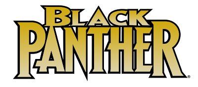
BLACK PANTHER: The Marvel Knights era Black Panther logo is recreated here using a font called Wolf's Bane II with some tweaks, notably on the "A"s. I somehow never noticed until working on this that the logo is heavily modified from the same style letters as in Wolverine's logo.
BLACK WIDOW: I have no special attachment to this particular logo; I simply made it because, being all blocky, it was really easy to reproduce by hand with no need for a font. I believe this one comes from one of Black Widow's more recent series, probably from the mid-late 00s (though I added the emblem to the left of "Widow", which accompanies some of her other logos but did not originally appear with this one).

CAPTAIN AMERICA: My all-time favorite Cap logo is from the mid-eighties - early nineties Mark Gruenwald run. It's based on Cap's original logo, which was created by Joe Simon, and is still in use today in the various CAPTAIN AMERICA movies. Here, I used a font called American Captain, based more on the movie version, and modified the letters slightly to recreate the Gruenwald era logo.

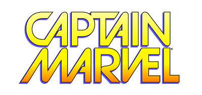
CAPTAIN MARVEL: I like Carol Danvers better as Captain Marvel than as Ms. Marvel (or Warbird), so I figured I'd try to replicate the logo of her more recent comic series. This logo appears to be modified from a font called Strasua, so I used the same font, altered it myself, and wound up with a pretty good copy of Carol's logo.
DAREDEVIL: According to Comicraft, they created this logo in the late nineties using their own The Story So Far font. Well, The Story So Far costs $49.00, and even if I was disposed to buy it, it would require a lot of modification to get the curve and slant right. So instead I did my best to recreate what I consider the definitive Daredevil logo by hand. This was the fist of these logos that I worked on, and while I think it turned out okay, it could certainly be a lot better/smoother.

DEADPOOL: As with Black Widow's, I really have no particular attachment to this logo; I just made it because it was extremely simple. It's a font called Rogue Hero with minimal modifications. This is, of course, the hyphenated version which adorned the Joe Kelly-written DEADPOOL series of the late nineties.

DOCTOR STRANGE: I mostly tend to favor big, bold logos, but for Doctor Strange, I found that the Marvel Studios' movie logo, which is a fairly simple serif font, fits the character very well. I discovered that the typeface is called Baker Signet, and it's a commercial font costing $29.00. Cheaper than Comicraft fonts for sure, but still -- I'm just doing this for fun; not looking to buy a bunch of fonts I'll only use one time! Instead I did my best to recreate the letters from the Marvel Studios logo using other fonts and tweaking the serifs to make it all work. I think it came out okay, and with some color added to make it look more "comic booky" than the movie version, it's not too bad at all.

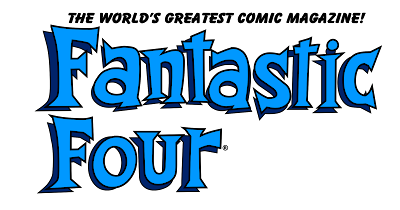
FANTASTIC FOUR: Using a font called Fantique Four, I made a few tweaks and came up with this classic logo, reproduced as best I could from the John Byrne era on the series. I cheated on the "The World's Greatest Comic Magazine" blurb, though. I didn't want to try to recreate those letters by hand, so I just used an old standby, Bazooka, which more or less resembles the original text.
GUARDIANS OF THE GALAXY: Galactic Vanguardian is designed to mimic the GUARDIANS OF THE GALAXY movie logo, and using that as my starting point, I attempted to put together a version of the logo that -- as with DOCTOR STRANGE -- I like to think is more "comic booky" than its cinematic counterpart.

HULK: I really like how this one turned out. Again, there's no font here; it was all done by hand to replicate the logo from Marvel's 2014 HULK comic series by Mark Waid, Gerry Duggan, and Mark Bagley -- and, while I've never actually read those issues, I can pretty safely declare this my favorite Hulk logo of all time. Fortunately, since it's all big block letters, it was a really simple affair to put together. And since "Hulk" doesn't look right to me without "The Incredible" preceding it, I added that bit -- even though it wasn't part of the original logo -- with a simple use of the well-worn Helvetica font, but "squashed" a bit.

IRON FIST: I really like this one, which adorned Iron Fist's solo series in the seventies and has popped up now and then since. It's another that I reproduced by hand, and as with the Hulk, this proved a relatively simple task since it's mostly all squared off block letters aside from the "O" and the "S". The original logo had little rivets stuck in the letters, but I removed those to streamline it -- something I believe Marvel has done as well in recent years.

IRON MAN: And yet another done by hand! This is far and away my favorite Iron Man logo, for the size and weight it conveys. I've never quite understood why Marvel switched away from it in the nineties. Every logo the character has had since looks light and wimpy in comparison with this one. Anyway -- you'd think this would've been as simple as Iron Fist's and the Hulk's logos, given every letter is a squared block, but due to all the depth tricks the original designer employed, it took more time and effort than I expected! "The Invincible" is the classic font Impact, which costs $49 a la carte, but comes standard with Windows, and is more or less what it looked to be based on in the original nineties-era covers.

LUKE CAGE: There's a font out there based on the logo used for Cage's Netflix series, so I grabbed it and used it, with some tweaks, to create this reproduction -- though the "Hero For Hire" text is my own contribution. Cage's name just doesn't look right to me without that subtitle!

MOON KNIGHT: Moon Knight is tied with Adam Warlock as my favorite second/third tier Marvel character, and this logo, from his original eighties series, is far and away my favorite for the character. This one was produced entirely (and lovingly) by hand.

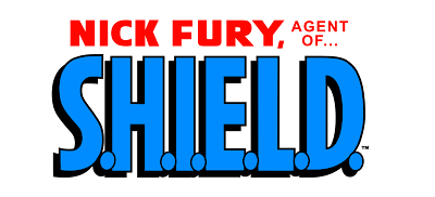
NICK FURY, AGENT OF SHIELD: Fury as a solo character doesn't do a lot for me, though I have at least read Jim Steranko's famous issues from the sixties -- and this logo accompanied that run. Again, I created this one by hand.
SCARLET SPIDER: The "jagged letters" logo never fit Spider-Man in my opinion; I have always preferred (and always will) the original AMAZING SPIDER-MAN logo, which we'll get to in a moment. But I see no reason the jaggies can't be applied to Spidey's clone brother, the Scarlet Spider -- since the jagged logo was in use when he debuted, it only makes sense he should inherit that letter style while Peter Parker retains the classic logo. Marvel agrees, I suppose, since Scarlet Spider's recent series have both used this logo. There are a number of fonts out there featuring this typeface, though to attain the exact look used in the official Scarlet Spider logo, I had to make some tweaks to the one I used.

SHE-HULK: She-Hulk has had several logos over the years, and while I have a soft spot for her SENSATIONAL SHE-HULK logo that accompanied John Byrne's run on the character, this one -- from the Dan Slott era of the mid-00s -- is actually my favorite. More than any other, I feel like it captures the fun side of the character, while still reminding readers that she is, after all, a Hulk. Once again, I did this one by hand -- and once again, since the letters are mostly all blocks, it was pretty easy to pull off.

SPIDER-MAN: As noted above, the original, classic, accept no substitutes Spider-Man logo is far and away the best for the character. It's been tweaked over the decades -- originally "The Amazing" was much further separated from "Spider-Man", for example -- and this is the version I like most. Despite the very plain letters involved in this logo, I couldn't find that anyone has ever created a font that tries to duplicate it, so this one is done by hand -- and getting the curve right was a huge pain! I'm not exactly satisfied with this one, though I guess it gets the job done.

THOR: I'm really proud of this one. It's another I had to do entirely by hand since there's no font that even remotely resembles it, and I think it turned out great. It's based upon the Walter Simonson era Thor logo, which is easily the most definitive of all time (I'm kind of amazed Marvel Studios hasn't used it for any of the movies).

THUNDERBOLTS: This one was an exercise in frustration! I actually thought it would be easy. The main THUNDERBOLTS logo looks more or less like Impact, a pretty common font, but stretched and slanted. Unfortunately, the stretching and slanting of the curved letters turned out to be a bigger hassle than I expected, and the "O" with the lightning bolt in the center was a big pain. On top of that, the "Justice, Like Lightning..." tagline is (I assume) some random Comicraft font which -- even if I knew which one it was -- I would not want to pay for... so I had to recreate it by hand. I'm not a hundred percent pleased with the final result here, but I love the Busiek/Nicieza/Bagley THUNDERBOLTS, and I really wanted to represent it.

WOLVERINE: A classic logo designed in the early eighties by Tom Orzechowski, this one is simply the Wolf's Bane font with very minimal tweaks.
X-MEN: Another one I'm pretty proud of, and another I had to do entirely by hand. This logo was created by Jim Steranko in the sixties and adorned pretty much every issue of UNCANNY X-MEN for the subsequent thirty-five or so years! It's a classic and I've never been sure why Marvel abandoned it in the early 00s. "The Uncanny" is Helvetica at a squashed height, which is how I got the idea to do the Hulk's "The Incredible" up above.
* The true origin of my interest in logos seems to be tied to the long-running MARVEL SUPER HEROES ROLEPLAYING campaign that I've mentioned here a few times in the past. As the game master, I came up with the adventures and arbitrated the rules, but from my perspective, my task didn't end there! After every adventure, I created an "issue cover" to represent the comic book version of what we had played -- and I spent a lot of time studying logos and lettering styles to come up with same for my own covers.


Ah, the Simonson Thor logo. Among all the neat things in that run, it's one of the neatest how in the cover of the first issue #337 Beta Thor wrecks the old logo so bad that it needs to be replaced.
ReplyDeleteFunny coincidence actually but the issue is only month apart from UNCANNY #176 where Cyclops' beam shattering the logo apparently was a huge issue to the editoriate (according to the Comic Book Legends Revealed IIRC). Gotta wonder if it was connected. Weezie was the editor at the time.
The Simonson Thor logo was such a breath of fresh air that people were mentioning it in the letters pages of the time. Thor got a completely new visual look and style from Simonson and the new logo just capped it off perfectly. Simonson's run was amazing.
DeleteDamn, even the corner boxes. Bill wrecks the old "Don Blake" Thor corner box too in #337, replaces him there for the duration of the arc until the last issue has Mjolnir and Stormbreaker crossed in the box, and after that Thor resumes the box duties stealing Bill's pose in #341.
DeleteSuberb.
Gee, I didn't know that logo was so beloved beyond me! I really do think it was definitive, and I have no idea why it isn't still in use. It's really cool.
DeleteI wonder if it was designed by Simonson himself, or by John Workman (or someone else)?
does anyone know what font is Storm's X-men logo?
ReplyDelete